 13/12/2010 |
Friday, 10 December 2010
Weather and Tide time
We have decided to film on this coming saturday. We will be going to Leigh-On-Sea to film our remaining footage. As we will be filming by the sea, it is important to be sure of any weather conditons.
Wednesday, 8 December 2010
Experimenting with Photoshop - Magazine Advert 2

Today we had a magazine designer come in to teach us the basics in how to use Photoshop. The image above is the advert that I began making in the workshop. We looked at the typical things you'd find in a magazine advert during research from a previous lesson. Although, the advert isn't finished it does include the main things you'd expect to find on a magazine advert for example the name of the artist, the album release date and where the consumer could buy the album.
Posted by Maria Grillo
Tuesday, 7 December 2010
Planned Shoots
08/11/10
We have decided to re shoot the scenes in Trafalgar Square. After uploading our footage, we realised that whilst there we failed to get a establishing shots or any shots of famous landmarks that we could cutaway to. In addition, as this scene is a time lapse scene, it was important that our actor stayed completely still for a long length of time so that when the footage is sped up, she is still throughout. However, we didn't film her standing still for long enough.
09/11/10
On Thursday, we have decided to go and film the scenes for the first verse and chorus. This is the argument scene between our two actors. We had originally planned to do this at Sonia's house but Sonia mum wasn't as keen on us filming there so we changed our location to my house.
Posted by Maria Grillo
Magazine Advert Research
The research that I did in class was looking at 5 different album posters and see who the artist is and what genre, the images and effectiveness and which elements from each of the covers would i be able to put into my on album cover.
The first artist I found was a solo artist named Paul Weller, I didn't know what music genre he was so i assumed he is either rock or country music. The images used in the cover was there was a huge picture of the artist playing the guitar and also there were still pictures showing the extra documentaries about him. These images were very effective as they gave us an idea of what sort of instruments he uses but also shows us there are special features included such as the documentary about his life. Therefore this shows the what people miss out on when they download rather than purchasing an album cover which includes extra features, documentaries. The elements which we may be able to take from this cover are the still shots from the music video and also the layout and font size and colour.

Another artist I found was Crowded House Intriguer, the images used in the cover was of a bear which was very effective as it makes people want to find out more about it. The picture and the font colour and size stood out which was an effective way of getting audience attention. The elements that would probably be used from this cover would be the size and colour of the font and also the release date, sponsors.
Another artist was Hawksley Workman, the image on his cover was rather large of him holding a guitar and there was his name in a large format going across him. All of these covers had the release date, band website and other websites like amazon.
 The elements we could take from this cover would be the layout as in having the artist stand or sitting with the name of the album going across them.
The fourth artist i looked at was Hearts and Minds Seth Lake, there weren't many images on this cover however the unique font they used was very effective to catch the audiences attention. As this looked very effective it will be one of the elements we could use for our album cover and also the plain backgroung color which makes the font stand out.

The final artist I looked at was Gogol Bordello, his cover was of him holding a guitar and standing in front of a lampost and and a wall which had the words 'Gogol Bordello'. What was effective about this cover was the layout of him standing in front of a lampost and wall which clearly made the name stand out. We could use this element of the cover in our own album by having our artist stand in front a of a plain wall and the use photoshop to customise it. Our photoshop class will be held on Wednesday so we can learn and practice our ideas.
By Mirza
The first artist I found was a solo artist named Paul Weller, I didn't know what music genre he was so i assumed he is either rock or country music. The images used in the cover was there was a huge picture of the artist playing the guitar and also there were still pictures showing the extra documentaries about him. These images were very effective as they gave us an idea of what sort of instruments he uses but also shows us there are special features included such as the documentary about his life. Therefore this shows the what people miss out on when they download rather than purchasing an album cover which includes extra features, documentaries. The elements which we may be able to take from this cover are the still shots from the music video and also the layout and font size and colour.

Another artist I found was Crowded House Intriguer, the images used in the cover was of a bear which was very effective as it makes people want to find out more about it. The picture and the font colour and size stood out which was an effective way of getting audience attention. The elements that would probably be used from this cover would be the size and colour of the font and also the release date, sponsors.
Another artist was Hawksley Workman, the image on his cover was rather large of him holding a guitar and there was his name in a large format going across him. All of these covers had the release date, band website and other websites like amazon.

The fourth artist i looked at was Hearts and Minds Seth Lake, there weren't many images on this cover however the unique font they used was very effective to catch the audiences attention. As this looked very effective it will be one of the elements we could use for our album cover and also the plain backgroung color which makes the font stand out.

The final artist I looked at was Gogol Bordello, his cover was of him holding a guitar and standing in front of a lampost and and a wall which had the words 'Gogol Bordello'. What was effective about this cover was the layout of him standing in front of a lampost and wall which clearly made the name stand out. We could use this element of the cover in our own album by having our artist stand in front a of a plain wall and the use photoshop to customise it. Our photoshop class will be held on Wednesday so we can learn and practice our ideas.
By Mirza
Monday, 6 December 2010
Magazine Advert Research
Studying 5 magazine adverts from different artists allowed me to understand what we could possibly use in our magazine advert. From looking at a variety of different adverts, I was able to understand the common features of an advert.
 Manic Street Preachers
 Weller
 Warpaint
 Hawksley Workman
The image of the artist is the background image. This is effective as the image is dominant and makes the artist stand out. Also, the album image is also effective as it allows the audience to make the link between the artist and album, so they know what to look for when buying the album.
 Crowded House
This advert uses an animation of a bear, unlike the other adverts there is no image of the artist. This makes it seem as though their name speaks for itself and because they have such an established fan base they don't need to show their picture.
Posted by Maria Grillo
 Manic Street Preachers
This advert by Manic Street Preachers is effective as it shows a man taking a photograph using a polaroid camera something that is rare in use today. This gives the advert an edgy look. The advert uses star ratings and comments from well known magazines and newspapers as a persuasive technique in order to convince readers that the album is good so they will buy it. This is a main feature of the advert and takes up a large part of the page.
 Weller
This advert by Weller as it makes the artist stand out as a solo artist as it shows all eyes are on him, the image is very dominant and the use of strobe lighting and spotlights add to this. This is also used to advertise his documentary and as it is a CD/ DVD box set, this gives the reader an extra incentive to buy the CD as they are getting more. We could also give the reader something extra to persuade them into buying our artists album and not just download it.

Just like our artist, this is Warpaint's debut album. It is interesting to see that the image of the band is the most dominant on the page. This shows that they are establishing themselves as a band to a world that is unfamiliar with them. The use of star ratings from magazines makes the advert persuasive the magazine's have a good reputation in the music industry and so their opinion would be taken seriously.

The image of the artist is the background image. This is effective as the image is dominant and makes the artist stand out. Also, the album image is also effective as it allows the audience to make the link between the artist and album, so they know what to look for when buying the album.
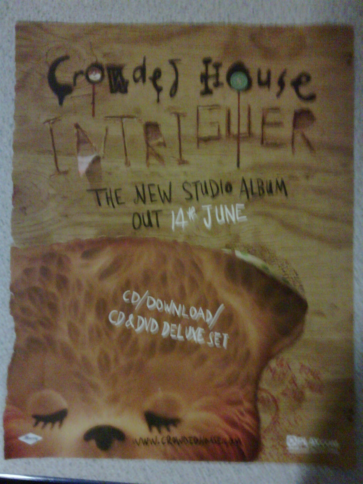 Crowded House
 This advert uses an animation of a bear, unlike the other adverts there is no image of the artist. This makes it seem as though their name speaks for itself and because they have such an established fan base they don't need to show their picture.
Posted by Maria Grillo
Analysing Advert Research
In the lesson we looked at CD advertisements on different artists. Looking at these adverts helped to highlight the significance of album covers as they all had their own original ideas to suit their audience type.
The following information explains my understanding of CD advertisements:
Manic Street Preacher: This is an image of a half dressed man taking a polaroid photograph in black and white. This image is effective because it clearly stands out of the page and the man is holding a polaroid camera which we don't use much nowadays. I think that doing this shows that the artists may be into the style of music that existed in the 60's as that was when it became common for everyone to use. It caught my eye straight away because of the size of the image and the fact that the man is half dressed. I think that the advert focuses on the artist image. It would be a good idea to also focus on the artist image because we will be promoting a new artist so having an image of the artist shows any consumers what the artist is like.
Warpaint: This is an image of four women dressed in hippie style clothing, each representing their individuality. This image of the band is bigger than the album cover. This therefore shows that the band are trying to promote their band for consumers to be familiar with them. Taking this to mind we would also use and image of our artist to show establishment.
Weller: Th
Friday, 3 December 2010
Rough Cut Footage - Verse 2
Hey guys, we would like get some feedback from you concerning our music video
1) Watching the music video, what do you understand from the narrative?
2) Is the location suitable for the narrative?
3) Does the artist look like another artist in the indie-pop genre?
4) Is there anything else you would like to see in the music video?
5) What do you understand from the narrative in this clip?
Subscribe to:
Posts (Atom)